Meat Pack: Hijack

Meat Pack: Hijack

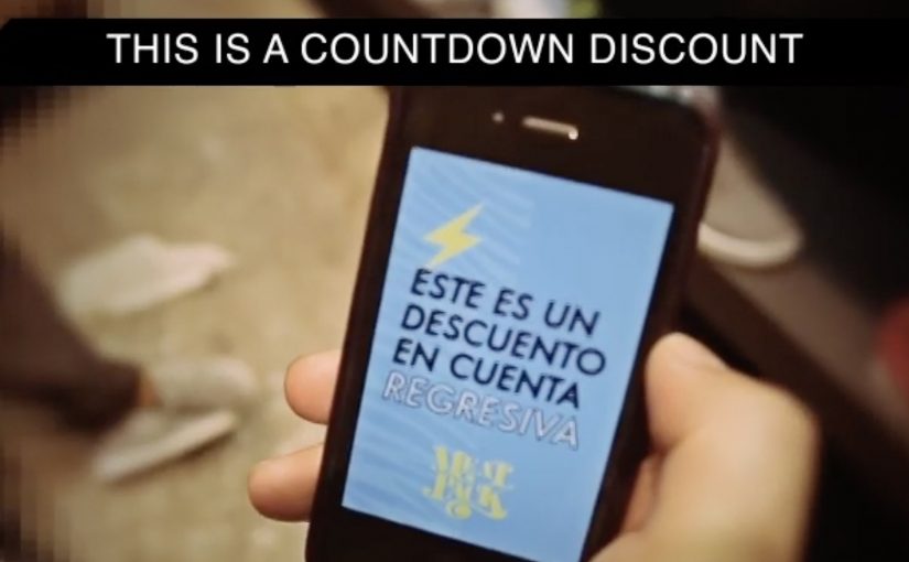
You walk into a competitor’s store to browse shoes. Your phone buzzes. Meat Pack offers you a discount that starts at 99%, then drops by 1% every second. If you want the deal, you have to move.

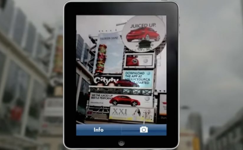
For a new discount promotion, Meat Pack, a shoe store in Guatemala known for an edgy, irreverent style, created Hijack, described as a GPS-based enhancement to their official smartphone app. Each time a customer entered the official store of one of the brands sold at Meat Pack, the app triggered a promotional message with a countdown offer. The discount started high and decreased every second, then the countdown stopped when the customer reached Meat Pack’s store.

Definition tightening: This is geofencing. A mobile app uses location signals to detect when you enter a defined physical area, then triggers a message based on that location event.

Turning a discount into a race

The mechanism is deliberately ruthless. The offer is so large it interrupts whatever you were doing, and the time pressure converts curiosity into action. The “best possible price” is available only at the exact moment your intent is hottest, while you are literally standing inside a competitor’s store.

In dense urban retail environments where shoppers compare options across nearby stores, location-triggered pricing can create an immediate switching incentive precisely at the point of decision.

Why it lands

It lands because it is a clean behavioural hack. The discount is not just a number. It is a ticking loss. Every second you hesitate, you feel the deal slipping away, which makes running across the street feel rational. The campaign also bakes in bragging rights by reportedly posting successful redemptions to Facebook, turning individual wins into social proof.

Extractable takeaway: If you want people to switch behaviours fast, combine a dramatic incentive with a visible countdown that makes hesitation feel expensive, then make the “next step” unmissable and immediate.

The business intent behind the provocation

This is conquesting with teeth. It aims to convert high-intent foot traffic that is already shopping the category, and to do it at the moment a competitor is paying the cost of acquisition. Reported results from the period describe hundreds of customers being “hijacked” and discounted inventory selling through quickly.

This is smart conquesting, but it only works when the store is close enough for the sprint to feel real. The real question is whether the route from trigger to redemption is short enough to make switching feel instant.

What this retail ambush gets right

  • Trigger at the true decision point. Not at home. Not later. At the shelf moment.
  • Make the offer legible in one second. “99% now, dropping” beats a paragraph of terms.
  • Use urgency with a real rule. A countdown works when it actually changes the outcome.
  • Design the route. If people cannot act quickly in real geography, the mechanic collapses.
  • Handle social sharing carefully. If you auto-post, consent and control decide whether it feels fun or creepy.

A few fast answers before you act

What is Meat Pack “Hijack”?

A location-triggered promotion inside Meat Pack’s app that detects when customers enter competitor brand stores, then offers a discount that decreases by 1% every second until the customer reaches Meat Pack.

What is the core mechanism?

Geofencing triggers an offer at the competitor location. A countdown reduces the discount each second. The timer stops when the shopper reaches Meat Pack, turning the offer into a physical sprint.

Why is the countdown so important?

It converts interest into movement. The value loss is visible and immediate, so delaying feels like paying extra.

What are the biggest risks in copying this?

Customer trust and permission. Location tracking and social posting require clear opt-in. Poor transparency turns a clever mechanic into backlash.

What kind of business does this fit best?

Retailers with nearby competitors, fast redemption, and inventory they can afford to discount aggressively for short bursts.

eBay: Give-A-Toy Store

eBay: Give-A-Toy Store

One of the things that all people do during the holidays, besides real shopping, is window shopping. Storefront window displays therefore have a stronger significance during the holiday season. Keeping that in mind, eBay has developed a way to make this experience move from passive to interactive and engaging.

Give-A-Toy Store is a 3D Christmas window installation with QR code tagged toys, built to evoke the passer-by’s giving side. Scanning the QR codes inside the eBay app allows passers-by to donate that toy on the spot, with the window lighting up and rewarding them for the donation.

The window installation is currently available at Toys for Tots in New York (at 35th and Broadway) and San Francisco (at 117 Post St).

Additionally customers can also customize their own toys on eBay’s Facebook page. For each toy created, eBay will donate $1 (up to $50,000).

From window shopping to “giving on the sidewalk”

This is a simple flip. The window is no longer just display media. It becomes a donation interface. You look, you scan, you give. Then you get instant feedback in the physical world.

How the mechanism does the heavy lifting

The mechanic is intentionally friction-light. Toys are visually presented as scannable choices. The QR tag is the call-to-action. The eBay app is the checkout. The window lighting up is the reward loop, confirming that something happened and making the act feel social even if you are alone.

In high-traffic retail corridors, a good interactive storefront turns waiting and wandering into measurable intent, without asking people to step inside.

Why it lands in a holiday crowd

It works because it respects the window-shopping mindset. People are already browsing. They are already comparing. This just adds a small, clear next step that feels aligned with the season. The visual “thank you” in the window also matters. It makes the donation feel immediate and real, not abstract and back-end.

Extractable takeaway: If you can make the environment visibly react to a mobile action, you create trust and momentum. The moment becomes self-explanatory, and bystanders learn the behavior just by watching.

What the brand is really building

The real question is whether a holiday storefront can turn passing attention into a mobile action that feels immediate enough to complete on the sidewalk.

This is not only about donations. It is a product demo for mobile commerce in disguise. It shows that scanning can be a legitimate buying action, that the phone can complete a transaction in seconds, and that the brand can connect physical retail ritual with digital conversion.

What this teaches about interactive storefronts

  • Make the first action obvious. If scanning is the behavior, the codes must look like the product tag.
  • Design a physical confirmation. Light, motion, or animation reduces doubt and makes the act feel rewarding.
  • Keep the choice set tight. Fewer, clearer options beat a cluttered scene when people are walking past.
  • Match the moment. Holiday giving is a natural fit for “instant donate” mechanics.
  • Make it watchable. When others can see the window respond, you get free teaching and free social proof.

A few fast answers before you act

What is the core idea behind Give-A-Toy Store?

Turn a holiday window into a scannable donation experience, so giving happens in the same moment as browsing.

Why does the window lighting up matter?

It provides immediate confirmation and reward. That reduces hesitation, makes the interaction feel real, and invites others nearby to notice and copy the behavior.

What makes this different from a normal QR campaign poster?

The display is the product experience. The scene feels like a store window first, and the QR code is integrated as a natural “price tag” action rather than a separate ad instruction.

What is the biggest execution risk?

Friction. If scanning is unreliable, the app flow is slow, or the codes are hard to spot at walking distance, people will not complete the action.

How would you adapt this if you do not have an app?

Keep the structure. Use a fast mobile entry point, and pair it with a visible physical confirmation so people know their action worked.

Volkswagen Beetle: Juiced Up

Volkswagen Beetle: Juiced Up

A billboard looks normal until you point your phone at it. Then the Beetle “juices up” into a 3D scene that spills out of the frame, turning a static poster into something you can explore.

That is the twist behind Volkswagen’s Beetle “Juiced Up” launch, created with Red Urban. Traditional out-of-home placements like billboards and bus shelters double as augmented reality markers. Download the custom app, scan the printed ad, and a 3D experience unlocks on your screen.

An AR marker is a printed visual pattern that a camera can recognize. When the app detects it, it anchors digital 3D content to the real-world poster so the animation appears to sit on top of the physical ad.

The best out-of-home work turns “I noticed it” into “I did something with it”, without asking people to learn a new behaviour.

Why AR markers work so well in out-of-home

Out-of-home already has the two things AR needs. Scale and repetition. People pass the same placements multiple times, which makes it easier for curiosity to build. Once someone scans, the experience feels like a hidden layer you only get if you engage. In global consumer brands running large-scale launches, out-of-home works best when it functions as a repeated trigger, not a one-time impression. A revamp is hard to communicate through copy alone. A 3D reveal makes the “newness” feel more tangible, even if the viewer only plays for a few seconds.

Extractable takeaway: Treat the physical placement as the interface. Make the first scan feel like the poster is “unlocking”, and keep the payoff immediate so the viewer control feels effortless.

What this launch is really optimizing for

This is not just about feature education. It is about reframing the Beetle’s personality and making the redesign feel more assertive and contemporary. The real question is whether your out-of-home is only a reminder, or a trigger that rewards interactivity. The app is a proof device, meaning it proves “this is different” by behaving differently than a normal poster campaign. This approach is worth doing only when the interaction reinforces the product story, not when it is novelty for its own sake.

What to steal for your next OOH-led activation

  • Make the trigger obvious. A single prompt, scan here, is enough. Let the payoff do the persuasion.
  • Anchor the interaction to the medium. If it is out-of-home, the phone should feel like a lens on the poster, not a separate experience.
  • Keep the first moment fast. If the 3D reveal does not land immediately, the novelty collapses.
  • Design for “I have to show you”. The best activations create a demo impulse that spreads in person.

A few fast answers before you act

What is “Volkswagen Beetle: Juiced Up”?

It is an out-of-home launch activation where Volkswagen posters and billboards act as AR markers. A dedicated mobile app unlocks a 3D Beetle experience when viewers scan the ads.

Why use AR markers instead of a standard QR code?

Markers make the poster itself the interface. That keeps the experience visually seamless, and it helps the 3D content feel physically attached to the real ad.

What is the main benefit of this approach for a product revamp?

It makes “newness” experiential. A 3D reveal can communicate attitude and redesign energy faster than a feature list.

What is the biggest practical risk with AR OOH?

Friction. If the app install and scan flow is slow, most people will not complete it. The reward has to justify the effort quickly.

What is the simplest way to improve completion rates?

Reduce steps and increase immediate payoff. Clear instruction at the poster, fast recognition, and an instant 3D moment that feels worth showing to someone else.