TV Viewing: Super Bowl Meets HoloLens

TV viewing is overdue for a real change

The TV viewing experience does not change drastically for years. Bigger screens, better resolution, smarter interfaces. But the core behavior stays familiar.

That is why sophisticated headsets like Microsoft HoloLens feel like a genuine breakpoint.

They do not just improve the screen. They change the environment around it.

Microsoft and the NFL re-imagine the Super Bowl

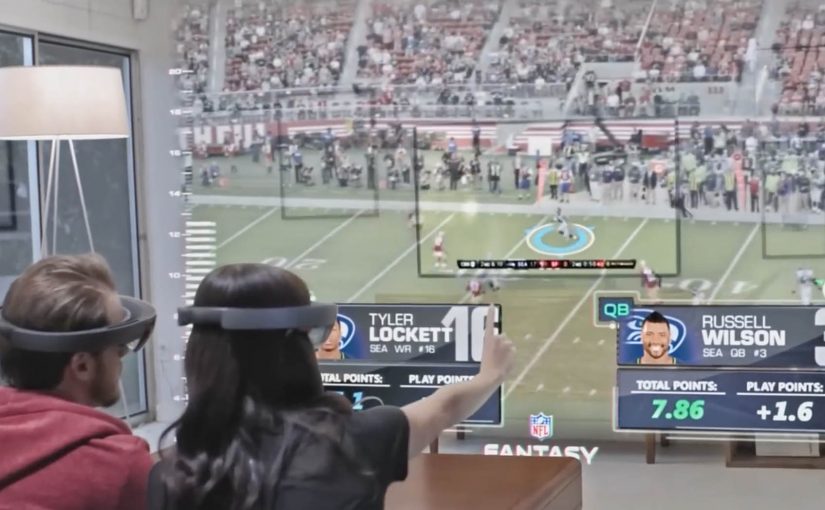
In a recently released video, Microsoft and the NFL re-imagine how a Super Bowl game could be watched with multiple friends and family members.

The scenario pushes beyond passive viewing. It turns the living room into an interactive layer, where the game experience becomes more immersive, more social, and more spatial.

By spatial, I mean the content is anchored to the room, not confined to the TV frame.

This is the kind of concept that makes the future of TV feel tangible.

In mass-market entertainment, the constraint is not what immersive concepts can show, but when consumer hardware becomes affordable, comfortable, and mainstream.

Why this lands for co-viewing

TV should prioritize co-viewing, meaning multiple people watching and reacting together in the same room, because a shared, spatial layer creates viewer control that a single rectangle cannot. The real question is whether you are designing for shared viewer control in the room, or just adding data overlays to a screen.

Extractable takeaway: When you move sports content into the room, design the experience around shared reference points, lightweight interaction, and conversation pacing, not around more screen real estate.

Immersive viewing is real. Consumer timing is not

The video shows how immersive TV watching can get. But Microsoft is not fast-tracking HoloLens for consumer consumption.

For now, only developers can order HoloLens, shipping this year.

No one knows when consumers get access, or when scenarios like this become a reality.

That uncertainty is part of the story. The vision is clear. The rollout timeline is not.

Steal these design cues for living-room sports

  • Design for the room. Treat the TV as one surface among many, then anchor the key moments and data where people naturally look and point.
  • Make co-viewing explicit. Support multiple viewers and viewpoints, so participation feels shared instead of “one person driving.”
  • Prototype for constraints. Assume headsets stay niche for a while, and test what still works when only one person has the device.

A few fast answers before you act

Is this still “TV” or something else?

It starts as TV content, but behaves more like a shared, spatial experience than a single screen.

What is the core shift headsets enable?

They move content off the rectangle and into the room, so viewing becomes environmental and interactive.

What is the biggest constraint right now?

Availability and consumer readiness. Until mainstream hardware adoption happens, this remains concept-led.

What should experience designers take from this?

Design for co-viewing and spatial context. Multiple people, multiple viewpoints, and shared interaction become first-class requirements.

What should you prototype first?

Prototype the simplest “shared moments” layer, so two to four people can compare and discuss the same play without anyone leaving the game flow.

KLM: Meet & Seat

Most brands use social channels tactically, mainly to reach people with social ads. KLM takes a different route by turning social into a flight feature, not just a media channel.

Last year KLM announced it would launch a social seating service in 2012 that lets Facebook and LinkedIn users meet interesting passengers on their flight.

From social graph to seat map

The mechanism is opt-in. Passengers can link a Facebook or LinkedIn profile to their booking, view other participating passengers, and use that context to decide who they might like to sit near. Instead of “broadcasting” brand messages, KLM uses social signals to make the journey feel more connected and a little less anonymous.

In global airline customer experience, social features only earn their place when they reduce travel friction while keeping passenger comfort and control intact.

Why this goes beyond advertising

The real question is whether your “social” idea earns a place inside the core workflow, or stays a bolt-on marketing layer.

This is not a campaign that ends when the media stops. It is a product layer that sits inside the booking and seat-selection experience. That matters because the value is practical. The idea helps solo travelers find relevant people. It helps professionals spot peers. It helps conference-goers connect before landing.

What makes the idea feel safe enough to try

The service is framed as voluntary. You choose to participate, and the experience only works if passengers trust they can opt in, opt out, and keep the interaction lightweight. That balance is the difference between “novel” and “creepy”, especially when your setting is an enclosed cabin for many hours.

Extractable takeaway: If a feature touches identity inside a captive environment, design for clear consent, easy exit, and low-pressure interaction first.

Where it is live, for now

Meet & Seat has now gone live and is currently available on KLM flights between Amsterdam and New York, San Francisco and São Paulo. The stated intent is to extend the service to other sectors over time.

Steal this pattern for social utility

  • Turn social into utility. A social feature that solves a real moment beats social content that asks for attention.
  • Make it opt-in by design. Voluntary participation is how you earn trust for anything identity-adjacent, meaning tied to real identity or profile data.
  • Embed it in a workflow. Booking and seat selection are high-intent moments where new features get tried.
  • Keep the promise small. Help people meet someone interesting. Do not overclaim “matchmaking”.

A few fast answers before you act

What is KLM Meet & Seat in one line?

An opt-in service that lets passengers connect via Facebook or LinkedIn and use that context during seat selection to sit near people they find interesting.

Why is this different from a normal social media campaign?

Because it is a service embedded in the travel journey, not content distributed around it.

Why does opt-in matter so much here?

Because seatmate selection touches identity and comfort. Participation needs to feel controlled, reversible, and low-pressure.

Where should a similar feature live in the journey?

Put it in a high-intent step, such as booking or seat selection, so people can try it when they already have a reason to act.

What is the main transferable lesson?

Stop treating social as a megaphone. Treat it as a signal you can convert into a useful moment inside the customer journey.

eBay: Give-A-Toy Store

One of the things that all people do during the holidays, besides real shopping, is window shopping. Storefront window displays therefore have a stronger significance during the holiday season. Keeping that in mind, eBay has developed a way to make this experience move from passive to interactive and engaging.

Give-A-Toy Store is a 3D Christmas window installation with QR code tagged toys, built to evoke the passer-by’s giving side. Scanning the QR codes inside the eBay app allows passers-by to donate that toy on the spot, with the window lighting up and rewarding them for the donation.

The window installation is currently available at Toys for Tots in New York (at 35th and Broadway) and San Francisco (at 117 Post St).

Additionally customers can also customize their own toys on eBay’s Facebook page. For each toy created, eBay will donate $1 (up to $50,000).

From window shopping to “giving on the sidewalk”

This is a simple flip. The window is no longer just display media. It becomes a donation interface. You look, you scan, you give. Then you get instant feedback in the physical world.

How the mechanism does the heavy lifting

The mechanic is intentionally friction-light. Toys are visually presented as scannable choices. The QR tag is the call-to-action. The eBay app is the checkout. The window lighting up is the reward loop, confirming that something happened and making the act feel social even if you are alone.

In high-traffic retail corridors, a good interactive storefront turns waiting and wandering into measurable intent, without asking people to step inside.

Why it lands in a holiday crowd

It works because it respects the window-shopping mindset. People are already browsing. They are already comparing. This just adds a small, clear next step that feels aligned with the season. The visual “thank you” in the window also matters. It makes the donation feel immediate and real, not abstract and back-end.

Extractable takeaway: If you can make the environment visibly react to a mobile action, you create trust and momentum. The moment becomes self-explanatory, and bystanders learn the behavior just by watching.

What the brand is really building

The real question is whether a holiday storefront can turn passing attention into a mobile action that feels immediate enough to complete on the sidewalk.

This is not only about donations. It is a product demo for mobile commerce in disguise. It shows that scanning can be a legitimate buying action, that the phone can complete a transaction in seconds, and that the brand can connect physical retail ritual with digital conversion.

What this teaches about interactive storefronts

  • Make the first action obvious. If scanning is the behavior, the codes must look like the product tag.
  • Design a physical confirmation. Light, motion, or animation reduces doubt and makes the act feel rewarding.
  • Keep the choice set tight. Fewer, clearer options beat a cluttered scene when people are walking past.
  • Match the moment. Holiday giving is a natural fit for “instant donate” mechanics.
  • Make it watchable. When others can see the window respond, you get free teaching and free social proof.

A few fast answers before you act

What is the core idea behind Give-A-Toy Store?

Turn a holiday window into a scannable donation experience, so giving happens in the same moment as browsing.

Why does the window lighting up matter?

It provides immediate confirmation and reward. That reduces hesitation, makes the interaction feel real, and invites others nearby to notice and copy the behavior.

What makes this different from a normal QR campaign poster?

The display is the product experience. The scene feels like a store window first, and the QR code is integrated as a natural “price tag” action rather than a separate ad instruction.

What is the biggest execution risk?

Friction. If scanning is unreliable, the app flow is slow, or the codes are hard to spot at walking distance, people will not complete the action.

How would you adapt this if you do not have an app?

Keep the structure. Use a fast mobile entry point, and pair it with a visible physical confirmation so people know their action worked.