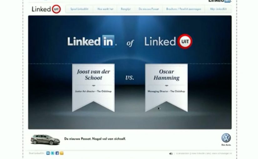
Volkswagen has released a LinkedIn-based campaign which takes full advantage of the new LinkedIn API. Here, “LinkedIn API” simply means the permissioned interface that lets an app read profile information after you sign in.
The campaign is called “LinkedUit” (LinkedOut) and gives anyone who challenges a friend on LinkedIn a chance to win a Volkswagen Passat.
The game is really simple. After signing in using your LinkedIn profile, the app lets you choose others in your network to challenge. A LinkedIn victor and a LinkedOut loser is then chosen based on education, experience, recommendations and connections.
Mechanically, the app pulls profile fields after sign-in and turns them into a score you can compare against someone in your network. This pattern is worth copying when you can explain the scoring in plain language and keep participation clearly opt-in. Because the inputs are already curated, the result feels personal with almost no extra work.
In European automotive marketing, platform-native games like this only stay credible when the data use is explicit and the scoring feels fair.
The real question is whether the value of the interaction outweighs the discomfort of being compared.
Why this is a smart use of platform data
This campaign uses something people already curate and care about. Their professional identity. Instead of asking for attention, it uses existing LinkedIn data as the raw material for the experience.
Extractable takeaway: If you can make a platform’s identity data the mechanic, you lower friction and raise relevance. But you only earn repeat use when people can predict why they won or lost.
- Low input for users. The profile is already built. The game simply reads it.
- High personal relevance. Comparisons feel personal because they are based on your own history.
- Built-in social spread. Challenges create a natural loop through networks.
The Passat benefit: “feature-rich” as a metaphor
The creative link is straightforward. Passat equals feature-rich. LinkedIn profile equals information-rich. The experience makes the metaphor tangible by turning profile depth into a competitive score.
That kind of metaphor works when it is easy to explain in one sentence and easy to experience in one click.
What makes this type of social game succeed or fail
- Fair scoring logic. If the rules feel arbitrary, people reject the result.
- Fast time-to-result. The payoff must arrive quickly after sign-in.
- Friendly rivalry. Challenges should feel playful, not judgmental.
- Clear reward. A chance to win a Passat is a simple, memorable incentive.
What to take from this if you are building platform-native campaigns
- Use the platform’s native data as the experience. The more you rely on what already exists, the lower the friction.
- Make the mechanic social by default. Challenges, invites, and comparisons drive distribution.
- Keep the brand connection clean. One strong metaphor beats multiple weak links.
- Design for credibility. When you use personal data, transparency and perceived fairness matter.
A few fast answers before you act
What is Volkswagen “LinkedUit”?
It is a LinkedIn-based campaign that uses LinkedIn profile data to create a challenge game, giving participants a chance to win a Volkswagen Passat.
How does the game determine a winner?
The app compares elements such as education, experience, recommendations, and connections to choose a “LinkedIn victor” and a “LinkedOut” loser.
Why is the LinkedIn API important here?
Because it enables the experience to pull in profile information automatically, making the game quick to start and personally relevant without extra data entry.
What is the creative link to the Passat?
The campaign uses the idea that the new Passat is full of features, just like a LinkedIn profile is full of information, then turns that into a competitive mechanic.
What is the main lesson for social platform campaigns?
If you build around native identity and data, and make the interaction social by default, you can create an experience that spreads through the network naturally.