Mercedes-Benz: Transparent Walls for PRE-SAFE

For the PRE-SAFE® precrash system from Mercedes-Benz, ad agency Jung von Matt in Germany set out to make chaotic traffic intersections safer.

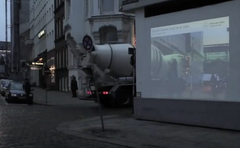
The idea was to let everyone “look around the corner” as if walls were transparent. In this execution, “transparent walls” means projecting a live camera view onto the building edge so the blind spot becomes visible. A camera filmed what was happening out of sight around the corner, and the live images were projected onto an 18/1-format billboard mounted on the building edge for approaching traffic to see.

When out-of-home becomes a live safety interface

This is not an awareness poster. It behaves like infrastructure. The corner. The blind spot. The moment of uncertainty. All become the media placement and the message at the same time.

The real question is whether your safety story behaves like a tool at the decision point, not a slogan people ignore.

How the mechanism creates “transparent walls”

  • Capture. A camera records the street view that drivers cannot see until they commit to the turn.
  • Project. A large-format display on the building corner shows that view in real time.
  • Anticipate. People approaching the intersection get a few extra seconds to recognise a cyclist, car, or hazard.

In urban mobility and automotive safety communications, making risk visible in the moment can change behaviour faster than warning copy.

Why it lands

Safety messages often fail because they arrive as abstract advice. This one arrives as immediate utility. It gives people a concrete, legible advantage at the precise point where bad outcomes happen. Because the live projection turns hidden risk into visible information, the benefit is believed without asking anyone to trust a claim. Safety-led brand work should earn attention through utility, not admonition. The result feels less like advertising and more like “someone fixed a problem.”

Extractable takeaway: The most persuasive safety communication is not a claim. It is a demonstrable reduction of uncertainty, delivered at the exact moment people need it.

What the brand intent looks like underneath

The stunt does double duty. It dramatizes what PRE-SAFE® is for without explaining sensors, thresholds, or system logic. It also signals a brand posture. Mercedes-Benz is not only selling performance. It is selling anticipation.

Steal this pattern: make uncertainty visible

  • Build the message out of the environment. Pick a real-world constraint your audience feels, then solve it visibly.
  • Make the proof self-evident. If people can understand the benefit in one glance, the idea scales.
  • Reduce uncertainty, not fear. Practical clarity outperforms shock in public safety-adjacent work.
  • Choose the right “moment.” Place the intervention where decisions are made, not where people are merely passing through.
  • Design for all road users. Intersections are shared systems. Make the benefit readable for drivers, cyclists, and pedestrians.

A few fast answers before you act

What is “Transparent Walls” in one sentence?

It is a digital out-of-home installation that shows live footage from around a blind corner on a building-edge billboard, so approaching traffic can spot hazards earlier.

How does this connect to PRE-SAFE®?

It demonstrates the value of anticipation. Seeing danger earlier is the human equivalent of what precrash systems aim to deliver technologically.

Why use a live camera feed instead of a scripted film?

Because real-time content makes the utility undeniable. People trust what they can see unfolding right now.

What are the main execution risks?

Latency, visibility in different lighting conditions, weather robustness, and ensuring the display informs rather than distracts drivers.

How would you measure success?

Observed speed adjustments, braking behaviour changes, near-miss reduction at the intersection, dwell/attention metrics, and sentiment around perceived usefulness.

McDonald’s: Pick N’ Play Billboard Game

You are walking through central Stockholm and a McDonald’s billboard does something unusual. It invites you to play a quick Pong-style challenge on the screen, using your own phone as the controller.

DDB Stockholm has created another interactive outdoor campaign for McDonald’s Sweden called Pick N’ Play. Passers-by use their mobile phones as controllers to play for a chosen McDonald’s treat. If they last for more than 30 seconds, they score a coupon that earns them free fast food at a nearby McDonald’s.

Reportedly, the interaction avoids an app download and instead uses a simple mobile web flow, with proximity checks (via phone location) so only people physically near the screen can play.

Why this one pulls a crowd

The mechanic is instantly legible. Most people recognize Pong in a split second, which lowers hesitation and increases participation. The billboard also creates a public spectacle, which adds social proof and makes stopping feel normal, not awkward.

Extractable takeaway: This is rewarded interactivity, meaning the payoff is gated behind sustained attention instead of a tap. In outdoor, that simple “earn it” rule turns a public glance into a deliberate, measurable action.

What McDonald’s is really buying

The prize is not the point. The real value is a measurable bridge from street attention to store visit. A time-based win condition filters for people who are actually willing to pause, focus, and then act, which makes the coupon a higher-signal trigger than a generic discount blast.

The real question is whether your DOOH idea can turn a public moment into a private, trackable action without adding friction.

In global consumer brands and retail environments, interactive digital out-of-home earns its keep when it connects a public moment of attention to a private, trackable action on a personal device.

Steal these moves for your next DOOH game

  • Use a mechanic people already know. Familiar rules beat clever rules in outdoor contexts.
  • Make the phone the interface. It turns a billboard into a controllable experience and a trackable session.
  • Reward endurance, not clicks. Time-in-game is a simple proxy for real attention.
  • Close the loop fast. A coupon that can be redeemed nearby turns novelty into footfall.

Last year they had challenged pedestrians to take pictures of McDonald’s food to get it for free.


A few fast answers before you act

What makes an interactive billboard work in practice?

An interactive billboard works when the invite is understood in seconds and the first action feels effortless on a phone.

Do you need an app to control a billboard with a phone?

No. Campaigns like this are often built as mobile web experiences so participation is immediate and friction stays low.

How do you stop people from playing remotely?

By verifying proximity. A common approach is using phone location to confirm the player is physically near the screen before the session starts.

Why use a 30-second target?

It is long enough to prove engagement, short enough to feel achievable, and simple enough to explain with one line of copy.

What is the business upside versus a normal coupon?

You get a higher-intent audience. The coupon is earned through attention and action, which tends to correlate with stronger redemption and store visitation.

Ford C-Max Augmented Reality

A shopper walks past a JCDecaux Innovate mall “six-sheet” screen (poster-format) and stops. Instead of watching a looped video, they raise their hands and the Ford Grand C-MAX responds. They spin the car 360 degrees, open the doors, fold the seats flat, and flip through feature demos like Active Park Assist. No printed marker. No “scan this” prompt. Just gesture and immediate feedback.

What makes this outdoor AR execution different

This is where augmented reality in advertising moves from a cool, branded desktop experience to a marker-less, educational interaction in public space. Marker-less here means the experience does not need a printed marker or “scan this” prompt to start. The campaign, created by Ogilvy & Mather with London production partner Grand Visual, runs on JCDecaux Innovate’s mall digital screens in UK shopping centres and invites passers-by to explore the product, not just admire it.

The interaction model, in plain terms

Instead of asking people to download an app or scan a code, the screen behaves like a “walk-up showroom.”

  • Hands up. The interface recognises the user and their gestures.
  • Virtual buttons. On-screen controls let people change colour, open doors, fold seats, rotate the car, and trigger feature demos.
  • Learning by doing. The experience is less about spectacle and more about understanding what the 7-seat Grand C-MAX offers in a few seconds.

How the marker-less AR works here

The technical leap is the move away from printed markers or symbols as the anchor for interaction. The interface is based on natural movement and hand gestures, so any passer-by can start immediately without instructions.

Under the hood, a Panasonic D-Imager camera measures real-time spatial depth, and Inition’s augmented reality software merges the live footage with a 3D, photo-real model of the Grand C-MAX on screen.

Because the interface responds to natural hand movement, the interaction starts without instruction and keeps the focus on learning the product, not learning the UI.

In retail and out-of-home environments, interactive screens win when they eliminate setup friction and teach the product in seconds.

The real question is whether your outdoor screen is a passive impression machine or a walk-up product experience that teaches in under 30 seconds.

Why this matters for outdoor digital

If you care about outdoor and retail-media screens as more than “digital posters,” this is a strong pattern. This pattern is worth copying: design for viewer control and fast product education, not just looping impressions.

Extractable takeaway: Remove setup friction first, then use a small set of high-value interactions to teach one product truth quickly.

  • Lower friction beats novelty. The magic is not AR itself. The magic is that the user does not need to learn anything first.
  • Gesture makes the screen feel “alive.” The moment the passer-by sees the car respond, the display stops being media and becomes a product interface.
  • Education scales in public space. Showing how seats fold, how doors open, or what a feature demo looks like is hard to compress into a static ad. Interaction solves that.

Practical takeaways if you want to build something like this

  • Design for instant comprehension. Assume 3 seconds of attention before you earn more. Lead with one obvious gesture and one obvious payoff.
  • Keep the control set small. Colour, rotate, open, fold. A few high-value actions beat a deep menu.
  • Treat it like product UX, not campaign UX. The success metric is “did I understand the car better,” not “did I watch longer.”
  • Instrument it. Track starts, completions, feature selections, and drop-offs. Outdoor can behave like a funnel if you design it that way.

A few fast answers before you act

What is the core innovation here?

Marker-less, gesture-driven AR on mall digital screens that lets passers-by explore product features without scanning a code or using a printed marker.

What does the user actually do?

They raise their hands to start, then use on-screen controls to change colour, open doors, fold seats, rotate the car, and trigger feature demos like Active Park Assist.

What technology enables it?

A depth-imaging camera measures real-time spatial depth, and AR software merges live footage with a 3D model of the vehicle.

Why does “marker-less” matter in public spaces?

Because it removes setup friction. Anyone walking by can immediately interact through natural movement and gestures.

What should you measure to know it worked?

Track starts, completions, feature selections, and drop-offs so you can see which interactions people choose and where they bail out.