LEGO: Happy Holiplay

LEGO: Happy Holiplay

Holiday attention built from imagination

The most effective holiday campaigns often turn the audience into the media. LEGO’s execution is a clean example of that approach.

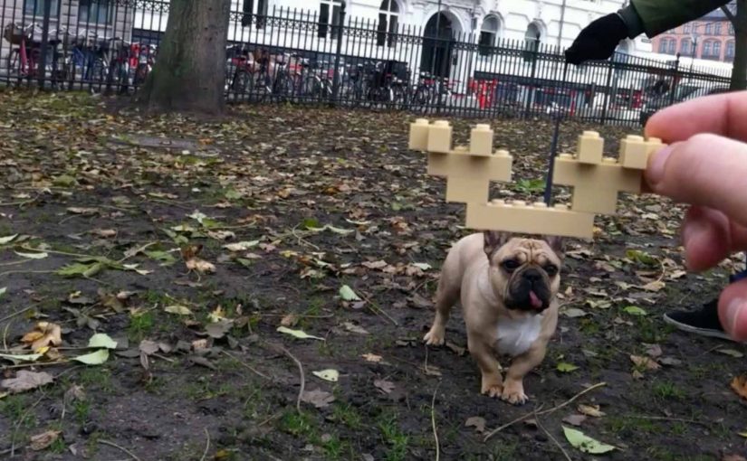
To create positive attention around the LEGO brand, a global digital social campaign challenged people to take their imagination with the well-known LEGO bricks one step further and share the results via digital media.

The campaign was dubbed Happy Holiplay and was run for three weeks. LEGO fans from 119 countries participated actively and uploaded pictures to www.happyholiplay.lego.com.

How Happy Holiplay worked in practice

The mechanism was community-powered. LEGO provided a clear prompt and a simple submission behavior. Build something imaginative with bricks, capture it, and share it digitally.

The campaign site acted as the collection point. The internet did the distribution. Every upload became both participation and promotion.

That loop matters because the content and the invitation travel together. Each creation nudges the next person to build and share.

In global consumer brands with strong fan communities, seasonal social campaigns work best when the participation loop is already native to the product and culture.

Why it landed for a global fan base

LEGO was naturally suited to participatory storytelling. The product already trained people to invent, remix, and share. Happy Holiplay did not try to manufacture behavior. It amplified what the community already loved doing.

Extractable takeaway: When your product teaches a repeatable creative habit, your job is to frame it with a simple prompt and a visible gallery, not to over-produce the story.

The holiday timing mattered too. December is a period when people are already in “make and share” mode, and when families have more reasons to create together.

The business intent behind Happy Holiplay

The goal was to generate positive brand attention during a competitive seasonal window by turning the community into the main media channel.

The real question is whether you can turn a seasonal moment into a repeatable participation loop, not whether you can publish more holiday content.

Rather than paying for attention, LEGO earned it by creating a platform for fan creativity, and by making participation feel like a celebration instead of a promotion.

If the behavior is not already native, a participation push will feel like work and the content will not compound.

What to steal for your next social campaign

  • Use a behavior that is already native to the brand. If the audience already creates, design the campaign around creation.
  • Keep the action simple. Build, capture, share. Low friction increases global participation.
  • Give the community a home base. A clear destination makes participation feel official and collectible.
  • Let contributors be the content engine. User-generated content (UGC) scales faster than brand-made assets when the prompt is right.

A few fast answers before you act

What was LEGO’s Happy Holiplay?

A global digital social campaign that invited fans to create imaginative LEGO builds and share them online.

How long did the campaign run?

It ran for three weeks.

How many countries participated?

LEGO fans from 119 countries took part and uploaded pictures to the campaign site.

Why did the campaign work so well for LEGO?

Because it amplified a natural LEGO behavior. Building and sharing creations. It aligned with the community’s existing motivations.

What is the key takeaway for other brands?

Design participation around an audience behavior you already own, then make sharing simple enough to scale globally.

Tokyo Shimbun: AR Reader App for Kids

Tokyo Shimbun: AR Reader App for Kids

A kid points a smartphone at a newspaper article and the page starts “talking back”. Characters pop up, headlines simplify, and the story becomes easier to understand without leaving print.

Connected devices such as smartphones and tablets have contributed to an explosion in digital media consumption. As these devices gain adoption, print newspapers around the world are seen suffering from declining readership and revenue. To combat this, Tokyo Shimbun, along with Dentsu Tokyo, came up with a new way to connect with readers. An augmented reality reader app brings the newspaper to life by overlaying educational, kid-friendly versions of selected articles.

How the newspaper becomes a “teaching layer”

The mechanism is straightforward. The app uses the phone camera to recognize specific articles, then overlays animated commentary, simplified explanations, and visual cues on top of the printed page so kids can follow along. Here, “teaching layer” means this AR overlay that translates the printed article into simpler language and guided visuals. Because the overlay sits directly on the printed article, kids do not have to leave the page to get context, which lowers friction and keeps attention on the story.

In publishing and media brands that still rely on print touchpoints, augmented reality can turn paper into an entry point for younger audiences without abandoning the physical ritual of reading.

Why this lands with parents and kids

It respects the newspaper as a shared household object, but removes the comprehension barrier for children. The child gets a friendly “translator”. The parent gets a moment of joint attention that feels educational, not like more screen time for its own sake.

Extractable takeaway: If you want kids to adopt a legacy touchpoint, use the digital layer to reduce comprehension friction first and add spectacle second.

What the business intent looks like

This is not only a novelty layer. It is a retention and habit play. If children can engage with a paper alongside adults, the newspaper has a better chance of staying present in the home and staying relevant as a family product.

The real question is whether the AR layer builds repeat, family co-reading habits, not whether it feels novel the first time.

Practical moves for print-plus-AR translation

  • Overlay explanation, not just effects. Make the digital layer add clarity, not only animation.
  • Choose a narrow trigger set. Start with selected stories that benefit most from translation and context.
  • Design for “family co-use”. Make it easy for a parent to participate without taking over the phone.
  • Keep the print object central. The magic works best when the page remains the interface.

A few fast answers before you act

What does the Tokyo Shimbun AR reader app do?

It lets kids scan selected newspaper articles with a smartphone and see animated, kid-friendly explanations layered on top of the print page.

Why pair augmented reality with a newspaper at all?

Because the newspaper is still a household touchpoint. AR can lower comprehension barriers for kids while keeping the shared reading ritual intact.

Is this mainly entertainment or education?

The strongest value is educational translation. The animations act as attention hooks, but the real utility is simplifying and explaining complex topics.

What makes this different from sending kids to a website?

The entry point stays on the printed page. The experience is anchored in the article the family is already holding, which supports shared attention.

What is the biggest execution risk?

If scanning is finicky or the overlays feel gimmicky, kids will not repeat the behavior and parents will not recommend it.

Hyundai Elantra: Driveway Decision Maker

Hyundai Elantra: Driveway Decision Maker

When choice made the Elantra harder to buy

In North American automotive marketing in 2012, the hardest moments are often the ones created by success: when a winner expands and the buyer suddenly has more to compare.

The Hyundai Elantra was named 2012 North America Car of the Year. Momentum was strong.

Then Hyundai introduced two additional variants. The Elantra Coupe and the Elantra GT. Suddenly, a clear win turned into a harder purchase decision.

More choice created more hesitation. Hyundai needed to simplify the decision again, without reducing the range.

Turning your driveway into the showroom

Instead of pushing another brochure or comparison chart, Hyundai built the Driveway Decision Maker, a tool that let prospective buyers preview what an Elantra would look like parked outside their own home.

By combining Google Street View, projection mapping, and real-time 3D animation, prospective buyers could see exactly what an Elantra would look like parked in their own driveway.

The experience replaced imagination with visualization. No guessing scale. No abstract renders. Just your house, your street, and the car.

In high-consideration categories where products physically live at home, a realistic preview in the buyer’s own environment reduces comparison fatigue.

Why seeing it at home removed friction

Car buying is emotional, but doubt creeps in when people cannot picture ownership.

Extractable takeaway: If your buyer must imagine ownership to decide, put a realistic preview into their own environment so the choice feels concrete.

The Driveway Decision Maker collapsed distance between consideration and ownership. By anchoring the car to a familiar, personal environment, Hyundai removed uncertainty about fit, size, and presence.

The experience also shifted control to the viewer. Instead of being told what to like, buyers explored the car in their own context.

The business goal behind the experience

The intent was not novelty. The real question is how you help someone choose when a clear winner becomes a lineup.

Hyundai wanted to reduce decision paralysis created by a broader lineup and move people confidently from interest to purchase. By helping buyers visualize the outcome, the brand shortened the path to commitment.

This was about restoring clarity, not adding noise. Interactivity is only worth it when it makes a decision easier.

What brands can steal from Driveway Decision Maker

  • Bring the product into the customer’s world. Context beats abstraction.
  • Replace imagination with visualization. Show the outcome, not the promise.
  • Use technology to remove doubt. Innovation works best when it answers a real buying question.
  • Support choice instead of limiting it. Help people decide rather than forcing simplification.

Hyundai invited consumers to try the experience themselves on the PickMyElantra site.


A few fast answers before you act

What problem was Hyundai solving?

Too much choice created hesitation. Buyers struggled to decide between Elantra variants.

How did the Driveway Decision Maker work?

It combined Google Street View, projection mapping, and real-time 3D animation to place the car into a buyer’s actual driveway.

Why was this more effective than a configurator?

Because it grounded the decision in a personal, familiar environment instead of abstract specifications.

What business outcome did Hyundai target?

Reducing purchase friction and restoring confidence across an expanded model lineup.

What is the transferable lesson?

If your product requires imagination to buy, use technology to make the outcome visible.