There are places in Paris where you can’t get any Internet connection. So Ogilvy Paris sets up free Wi-Fi hotspots in these areas and incentivises people to use them by first playing a short game of “Scrabble WiFi”.
Once the user proves their spelling skills, the score from the word is converted into free Wi-Fi minutes. The higher you score, the longer the connection. Sharing the score on Facebook doubles the connection time.
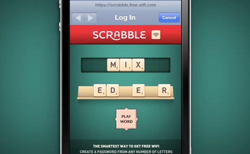
How “Scrabble WiFi” works as a hotspot experience
The idea uses a captive portal. That is the login page you see after joining a public Wi-Fi network. Instead of a password form, the portal presents a quick Scrabble-style word challenge and converts your result into time-based access.
- Select the Scrabble hotspot network.
- Play a short word round to prove spelling skills.
- Convert the word score into Wi-Fi minutes.
- Share on Facebook to double the time.
In cities where people regularly hit connectivity dead zones, turning access into a tiny game can make a utilitarian moment feel like a brand interaction.
The real question is whether your access gate can feel like a fair value exchange instead of a form-filled hurdle.
Why it lands: the reward is immediate and proportional
Most Wi-Fi gates feel like friction. This one feels like a fair trade: you invest a few seconds, you get online. The scoring mechanic makes the reward feel earned, and the “double time” social layer gives people a simple reason to broadcast what they just did. This is a stronger pattern than pushing people through a generic gate because it makes the unlock feel earned and quick.
Extractable takeaway: When you must gate access, use a tiny skill challenge with a proportional reward so the friction reads as a fair trade, not a hurdle.
What Scrabble is signalling with this mechanic
Scrabble WiFi frames spelling as a useful real-world skill, not just a boardgame pastime. It puts the brand in the same place people already reach for their phones and creates a repeatable reason to engage: better words mean more time online.
What to steal for your own “play to unlock” idea
“Play to unlock” means you swap a short interaction for immediate access, with the reward tied directly to what the user just did.
- Make the trade obvious. One action, one reward, with no hidden steps.
- Keep the game short. If the unlock takes too long, it stops being a reward.
- Use proportional rewards. Performance-based access feels fairer than random allocation.
- Add a clean share multiplier. Doubling time is easy to understand and easy to explain.
A few fast answers before you act
What is Scrabble WiFi?
It is a free hotspot concept where you unlock Wi-Fi minutes by playing a short Scrabble-style word game, with your score converted into connection time.
Why convert a word score into minutes?
It creates a simple value exchange. Better spelling performance earns a longer session, which makes the reward feel earned and transparent.
What does Facebook sharing add to the mechanic?
It turns an individual unlock into public reach by offering a clear incentive: share your score and your connection time doubles.
What is a captive portal in this context?
It is the login or welcome page that appears after you join a public Wi-Fi network. Here it is used to run the mini-game before granting access.
What should you measure if you run something like this?
Track successful unlocks, average session minutes earned, share rate, repeat plays, and sentiment, then compare against the cost of providing access.