Vodafone: Buffer Busters AR Monster Hunt

The pitch is familiar: “fastest network.” The execution is not. Vodafone Germany turns the claim into a street-level AR game where your city becomes the arena and “Buffer Monsters” become the enemy.

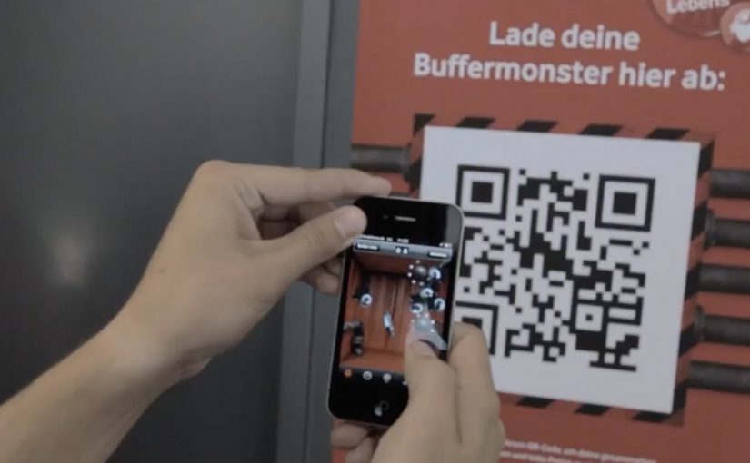
You walk around with an iPhone or Android smartphone, spot the monsters through the camera view, and capture them. Once you’ve banked 50, you take them to a nearby Vodafone store to “dump” them and keep playing. Top performers compete for a lifetime plan.

Gamified AR is a neat way to convert an abstract network promise into something people can experience with their own movement and time.

Turning buffering into a villain you can catch

The smartest move here is the metaphor. “Buffering” is a universal pain, so the campaign gives it a face, then gives you a job: remove slowness from the streets.

That story does two things at once. It makes the “fast network” positioning emotionally legible. It also creates a reason to keep playing beyond novelty, because the monsters represent a real frustration.

The mechanic: capture loop, then a store-based reset

The gameplay loop is intentionally simple:

  • Discover: find monsters while moving through real locations.
  • Capture: use the phone view to trap them.
  • Capacity cap: collect up to 50 before you hit the limit.
  • Reset in retail: visit a Vodafone store to unload the bank and continue.

The cap is not just game balance. It is the bridge to the business goal: repeat footfall into stores without making the experience feel like a coupon hunt.

In German consumer telecom marketing, a speed claim becomes believable when people can test it with their own time and movement.

The real question is whether you can turn an abstract promise into a repeatable challenge people want to complete and retell.

Why it lands: it makes speed social and competitive

This works because it turns “my network is fast” into a contest people can prove with their own time and movement. Players are not only consuming a message. They are choosing when to play, where to hunt, and how hard to push the leaderboard, which makes the brand message feel earned rather than delivered.

Extractable takeaway: When your promise is hard to verify, build a simple loop that lets people demonstrate it, then let competition and viewer control do the persuasion.

What Vodafone is really optimizing for

On the surface, it is an AR advergame, meaning a branded game built to carry a marketing message through play. Underneath, it is a store traffic engine plus a positioning reinforcer. The store visit is framed as part of the fantasy, so retail becomes a checkpoint, not an interruption.

It is also a clean way to recruit advocates. The people who do best are the ones most likely to talk about it, because the game gives them a score they can brag about.

Steal this capture loop for your next launch

  • Personify the pain point so the product promise has an enemy to defeat.
  • Add a capacity cap to create natural “reset moments” that map to business actions.
  • Make the brand touchpoint a checkpoint, store, event, or partner location, not a forced detour.
  • Design for retell, “I caught 50 monsters and had to dump them at a store” is a complete story.

The TVC supporting the initiative is also well done, and helps explain the mythology quickly for people who never touch the app.


A few fast answers before you act

What is Buffer Busters, in one line?

An AR street game from Vodafone Germany where you hunt “Buffer Monsters” with your phone, then reset your collection by unloading them at Vodafone stores.

Why does the “50 monsters” limit matter?

It creates a loop. Players hit a cap, then have a reason to visit a store to continue, which turns gameplay momentum into retail footfall.

What business problem does this solve beyond awareness?

It converts a network claim into participation, drives repeat store visits, and builds competitive motivation through leaderboards and prizes.

What makes the story-device strong here?

Buffering is a universal frustration. Turning it into a villain gives the “speed” promise a concrete, memorable meaning.

What is the biggest failure mode for AR hunts like this?

Friction. If discovery is unreliable, capture feels inconsistent, or permissions and setup are confusing, people drop before the loop becomes rewarding.

Ariel Actilift: Facebook-Controlled Shoot

Procter & Gamble Nordics, in collaboration with Saatchi & Saatchi Stockholm, B-Reel and Atomgruppen, creates an interactive campaign centered on a specially built glass installation in Stockholm Central Station, Sweden.

For one week, passers-by at Stockholm Central Station can watch designer clothes hung on a washing line being soiled by ketchup, drinking chocolate and lingonberry jam via fans on the Ariel Sweden Facebook page (or Denmark, Norway, Finland equivalents).

The mechanic: stain it from Facebook, then win it back clean

In order to win the designer clothes, Ariel fans use a Facebook-controlled industrial robot cannon to soil them. The stained clothes are then sent in the post after being washed on-site with regular Ariel Actilift.

In high-traffic European transit hubs, the strongest “social media” ideas are the ones that visibly change the physical world in front of everyone, not just the feed.

Why it lands: it makes participation feel consequential

This is a neat reversal of how most product demos work. Instead of the brand creating a controlled “before and after”, it invites the audience to create the mess themselves, then proves the wash result under public scrutiny.

Extractable takeaway: If you want participation that people remember, make the audience’s input irreversible in the moment, then let your product do the recovery. The contrast between “I caused this” and “it still comes out” is stronger than any claim line.

The glass box is doing strategic work. It turns a Facebook click into a visible event for commuters, which makes the campaign feel bigger than the people who are actually playing.

What the campaign is really selling

At a surface level it is a stunt to win clothes. At a deeper level it is reassurance. The mess is extreme and deliberately unglamorous, so the cleanliness result reads as confidence, not a carefully staged demo.

The real question is whether a Facebook click creates enough public consequence to make the cleaning proof feel worth watching.

What to steal for your next social-plus-physical idea

  • Let the audience create the proof: user-generated “inputs” that change the outcome are more persuasive than brand-controlled setups.
  • Use a public stage: a transparent environment creates trust because the product has nowhere to hide.
  • Keep the control surface simple: one clear action. One obvious effect. No complicated UI.
  • Design a real reward path: the prize should be operationally credible, not a vague “chance to win”.
  • Make the brand step undeniable: show the product moment on-site so the claim is witnessed, not narrated.

A few fast answers before you act

What is the core idea of this Ariel activation?

A Facebook interface controls a robot cannon that stains designer clothes in a glass installation. Ariel then washes the clothes on-site, and participants can win the cleaned items.

Why combine Facebook with a physical installation?

Because it turns digital participation into a public spectacle. The online action has a visible consequence in the real world, which makes it more engaging and more shareable.

What product truth is being demonstrated?

That Ariel can handle tough, visible stains. The audience creates the stains, and the brand shows the wash outcome under observation.

What makes this different from a normal product demo?

The brand gives up control of the “mess creation” to the public. That makes the demonstration feel less scripted and more credible.

What should you measure if you run something like this?

Participation rate, dwell time at the installation, social engagement tied to the control interface, earned media pickup, and any lift in product consideration during the activation window.

Berghs: Don’t Tell Ashton

Berghs School of Communication students want the advertising industry to notice their Interactive Communication class, and they decide to prove it instead of claiming it. They build a Twitter-driven artwork where participation is “paid” with a tweet.

The rule is easy to understand and easy to repeat. Tweet to join the frame. The more followers you have, the bigger your photo appears in the final piece. One person has enough followers to dominate the entire artwork by himself, Ashton Kutcher, so the campaign dares the internet with a simple prompt: Don’t tell Ashton.

How the social currency mechanic earns attention

The mechanism turns a social signal into a visible design system. Followers become “value”. Value becomes size. Size becomes status inside the artwork. Because the output is a single shared object, every participant has a reason to bring in more participants, and every new tweet is both payment and distribution.

In global creative education and talent recruiting, showing capability in a format that naturally spreads can outperform any brochure-style message about what you teach.

Why it lands

It uses a clean, game-like inequality that people instinctively understand. Bigger accounts get bigger presence. Smaller accounts still get in. The Ashton constraint makes the whole thing feel fragile and urgent, because one “wrong” tweet could ruin the artifact. Because the rule turns status into a visible outcome, people instantly understand why participation matters and why the object keeps spreading. That tension becomes the hook that keeps the story moving.

Extractable takeaway: If you want participation to scale, turn one simple social metric into a visible stake inside a shared outcome. Then add a single constraint that makes the outcome feel at risk.

What this is really doing for the program

This is a recruitment campaign disguised as an internet object. The artwork is the portfolio piece, and the spread is the proof that the makers understand how digital behavior works in the wild. The more people talk about the object, the more the school’s program name travels with it.

The real question is whether the program can turn its digital thinking into an object the industry wants to notice, share, and remember.

What to steal from the participation mechanic

  • Build one object people want to join. Collages, maps, frames, and leaderboards make participation legible.
  • Convert a metric into meaning. Followers, contributions, referrals, and time can become “materials” in the output.
  • Make the story retellable. If the rule cannot fit in one sentence, distribution collapses.
  • Add one constraint that creates urgency. A single “if X happens, we lose” condition can be enough.

A few fast answers before you act

What is the core idea of Don’t Tell Ashton?

A Twitter-built artwork where a tweet buys you a spot, and your follower count determines how large your portrait appears in the final piece.

Why tie portrait size to follower count?

It turns a social metric into a visible stake. That makes participation competitive, shareable, and instantly understandable without explanation.

What role does Ashton Kutcher play in the story?

He is the “edge case”. As the most-followed account in the story, one tweet from him could overwhelm the entire artwork, which gives the campaign its tension.

What makes this more than a clever stunt?

It demonstrates a transferable skill. Designing a mechanic where participation and distribution are the same action.

Why does this work better than a normal student showcase?

It makes the audience prove interest through participation. That produces evidence of relevance, not just a claim that the class understands interactive communication.