Burger King Truckvertising

Burger King Truckvertising

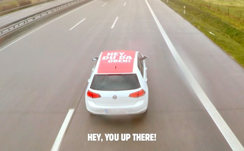
Due to strict laws, reportedly around 13,000km of the German motorway network is ad-free. So to convince truckers in Germany to buy freshly grilled Whoppers, Burger King and agency Grabarz & Partner create ads that only truckers can see. The ads sit on the roof of multiple cars that take turns overtaking trucks.

The cars do not just show an ad. They run a sequence of messages that feels like a conversation from the road:

  • “Hey, you up there!”
  • “You look hungry!”
  • “Why don’t you try out the Whopper?”
  • “Fresh and flame grilled”

Once the first few cars get the truckers’ attention, the remainder guides them to the next Burger King, turning the motorway into a moving funnel:

  • “If yes, then wink”
  • “Follow me to Burger King”

As a result, many truckers give in to temptation and follow the cars to the next XXL Burger King Drive-In.

The constraint that forces the creativity

The starting point is the limitation. Large parts of the German motorway network are ad-free, so the classic roadside billboard play is unavailable at scale.

The execution is “roof media” plus choreography

Here, “roof media” means ads mounted on the roofs of overtaking cars so truck drivers can read them clearly from above.

Burger King turns overtaking cars into a media surface and a delivery system. Roof placements ensure the message is visible from the truck cab. A rotating set of cars keeps the sequence going long enough to land.

The craft is the choreography. It is not one clever line. It is a paced interaction that escalates from attention, to appetite, to direction.

Why this works as shopper marketing in motion

The strength of this idea is that it turns media, message, and route into one conversion system. It works because the format, the sequence, and the physical route all point to the same next action: pull in at the next drive-in.

Extractable takeaway: When the audience is already moving toward a purchasable moment, the strongest creative system is the one that removes the need to interpret the ad and simply guides the next step.

In roadside retail and travel-heavy categories, the scalable advantage often comes from linking visibility, direction, and store access in one uninterrupted journey.

The real question is not how to make drivers notice the message, but how to turn that moment of notice into a low-friction detour.

The business aim is immediate drive-in visits from truckers who are already on the road and close to a Burger King location.

It also respects context. Truckers are not asked to scan, click, or search. They are asked to notice, react, then follow.

What to steal from Truckvertising

  • Turn constraints into the brief: Start with a hard constraint and treat it as a design brief, not a blocker.
  • Match the format to the moment: Use a format the audience cannot ignore in their context, in this case overhead visibility from a cab.
  • Design a behaviour sequence: Build a sequence that moves from attention to action, not a single punchline.

A few fast answers before you act

What is “Truckvertising” in one line?

Car-roof ads overtake trucks on ad-free motorways, deliver messages to truckers, then guide them to the next Burger King drive-in.

Why put the ad on the roof?

The roof is the placement truck drivers can reliably read from the higher truck cab as cars overtake them.

What is the conversion mechanic?

A staged sequence of overtaking cars gets attention, builds appetite, then provides directions to the next Burger King.

Why does the sequencing matter?

The idea is not one static message. Repeated overtakes let the campaign move from attention, to appetite, to direction.

What is the underlying business aim?

The goal is immediate local store visits and Whopper purchase intent from a high-propensity audience already in transit.

Amazon Go was never about checkout

Amazon Go was never about checkout

When Amazon Go surfaced, the headlines went straight to the obvious part. No cashiers. No checkout lines. Walk in, grab what you want, walk out.

It sounds like a stunt until you look at what it quietly challenges.

For decades, retail has been built around a fixed moment. The moment the customer stops. The moment the basket becomes a transaction. The moment the system catches up with reality.

Amazon Go takes that moment and tries to delete it. Not by making checkout faster, but by questioning whether checkout needs to exist as a separate step at all.

Position: Amazon Go is not primarily about convenience. It is about shifting the burden of “truth” from the customer’s confirmation to the system’s continuous sensing.

The real innovation is the part you don’t see

The experience is intentionally boring. That’s the point.

Nothing about the store screams “innovation” in the way tech demos usually do. There’s no “wow” screen at the end. No special ritual. No new behavior to learn. You behave like you always do. The store adapts around you.

That is the shift.

Amazon Go is less a store format and more a live system that tries to observe reality continuously. Who entered. What they picked up. What they put back. What they left with. Then reconciling all of that with identity and payment, without forcing you to participate in a checkout confirmation moment.

Retail has always relied on explicit confirmation. A barcode scan. A till. A receipt. A moment where the system can say, “Now we know.” Amazon Go is testing something different. A world where the system is confident enough, early enough, that it doesn’t need to ask.

In large omnichannel retailers, the hardest part is building operational truth without making customers do the bookkeeping.

Why this matters beyond convenience

If this works, it changes the definition of “frictionless”. Here, “frictionless” means uninterrupted flow. No queue and no explicit stop where the customer must confirm the basket.

Extractable takeaway: Removing a checkpoint beats optimizing it. But removing a checkpoint only works when you move its control logic into the system and design the exception path as carefully as the happy path.

Most retail innovation tries to shave seconds off steps. This tries to remove steps entirely. The customer doesn’t feel faster checkout. The customer feels absence. No interruption. No break in flow.

That absence is not just UX. It is a statement about operations.

When you delete a checkpoint, you do not remove work. You relocate it into sensing, reconciliation, inventory accuracy, and exception handling.

Because once you remove checkout as a formal checkpoint, the store must become more precise everywhere else. The “truth” can’t be created at the end of the journey. It has to be maintained throughout it.

And that’s why Amazon Go is interesting. Not because it eliminates a job role, but because it attempts to turn physical retail into something closer to software. A continuous system. Not a set of steps. A continuous system means a loop of sensing, reconciliation, and exception resolution, not a sequence of isolated handoffs.

What Amazon is really buying with this

Checkout-free is a design bet. You trade a visible control point for invisible control. That can reduce interruption for customers, but it also raises the bar for operational discipline behind the scenes.

The business intent is not “no lines” as a feature. The business intent is end-to-end reliability. Identity, item state, and payment have to reconcile cleanly without asking the customer to do the reconciliation work for you.

That is where the real cost sits. Sensors and models are only the beginning. The hard part is governance. How you handle misreads, disputes, refunds, edge cases, and the human operating model that keeps the system trustworthy.

Steal the pattern. Delete the checkpoint

The deeper takeaway is not “checkout-free store”. The real question is which checkpoints in your customer journey still earn their existence, and which ones only exist because your systems cannot carry the truth continuously.

  • Name your checkpoints. List the moments where the customer must stop to confirm something. Identity. Eligibility. Basket. Address. Consent. Payment.
  • Ask what the checkpoint protects. Fraud. Compliance. Inventory truth. Revenue assurance. If you cannot name it, you cannot redesign it.
  • Decide what “enough confidence” means. Define what the system must know before it stops asking the customer for confirmation.
  • Design the exception path first. The happy path is cheap. The edge cases are where trust is won or lost.
  • Measure absence, not speed. The KPI is not seconds saved. The KPI is interruptions removed without increasing disputes or operational cost.

Amazon Go is a reminder that sometimes innovation is not adding something new. It is removing something that no longer earns its existence.


A few fast answers before you act

What is Amazon Go?

Amazon Go is a retail concept that removes the traditional checkout step. Customers enter, pick up items, and leave without stopping at a register.

What is the real innovation behind Amazon Go?

The real innovation is not “no cashiers”. It is a live system that tries to observe shopping behavior continuously and reconcile what happens in the store with identity and payment without requiring a checkout confirmation moment.

Why does removing checkout matter?

Checkout is one of retail’s most fixed moments. Removing it reframes convenience from speed to absence. No queue and no interruption of flow.

What does Amazon Go suggest about customer experience design?

It suggests the biggest experience gains may come from removing steps that no longer earn their existence, rather than optimizing them. Removing a step only works when the system absorbs its control logic and handles exceptions cleanly.

What is the key takeaway from Amazon Go in 2016?

Amazon Go challenges the assumption that checkout must exist as a separate step. It tests whether retail can move from a sequence of discrete moments to a more continuous system of sensing, reconciliation, and exception handling.

Coca-Cola: First Drinkable Advertising

Coca-Cola: First Drinkable Advertising

You are looking at a Coke Zero ad on a billboard, on TV, in print, or even on radio. Instead of just watching it, you Shazam it. On your phone, Coke Zero appears to pour into a glass on-screen, and that moment converts into a free Coke Zero coupon you can redeem at select retail stores across the US.

The premise is blunt and smart. Many people think they know the taste of Coke Zero, but they actually do not. So Ogilvy & Mather creates a campaign where the quickest route from awareness to belief is not another claim. It is immediate trial.

How “drinkable” advertising is engineered

This execution turns Shazam into a universal call-to-action layer across media. Here, “drinkable” means the ad triggers a mobile pour moment that turns into a redeemable coupon for immediate trial.

  • Any channel can trigger the experience. Billboard. TV. Print. Radio.
  • The smartphone becomes the conversion surface. Visual payoff first, then the coupon.
  • The coupon bridges straight into retail. “Try it now” becomes a physical action, not a brand sentiment.

The important part is not the novelty of animation. It is the end-to-end path from message to product-in-hand, because the Shazam trigger and coupon make the next step unambiguous.

Why this works as shopper marketing, not just a stunt

The campaign is designed to reduce the classic friction points that kill trial. In performance-led shopper marketing, the fastest path from awareness to belief is reducing trial friction and making redemption immediate.

Extractable takeaway: If you want trial, design the interaction so it ends in redemption, not in more content.

  • No guessing what to do next. Shazam is the behaviour.
  • No abstract promise. The ad demonstrates “taste” by pushing you to the real thing.
  • No delayed gratification. The reward is immediate and concrete. A redeemable coupon.

It is experiential marketing that does not require a pop-up installation or a live event. The experience travels with the media buy.

This is shopper marketing done right. It treats media as the first step of redemption, not as a detour into “engagement.”

The real question is whether your media can trigger immediate trial without adding steps or new infrastructure.

Steal this: Shazam-to-trial loop

If you are trying to drive trial at scale, this is a reusable model.

  1. One trigger across channels. Create a single interaction that works across channels.
  2. Mobile as the conversion surface. Use mobile to make the experience feel personal and immediate.
  3. Redemption, not delay. Close the loop with a retail mechanic that is simple to redeem.

Do that well, and “engagement” stops being a vanity metric. It becomes a measurable bridge to purchase.


A few fast answers before you act

What makes this advertising “drinkable”?

Shazaming the ad triggers a mobile experience that ends in a free Coke Zero coupon. It is designed to turn exposure into real-world trial.

Why use Shazam in the first place?

It provides a consistent interaction across media formats, including channels where clickable links do not exist.

What business problem is this solving?

Driving immediate trial for a product where many people assume they already know the taste, but have not actually experienced it.

What is the key CX detail that makes it work?

A simple, familiar action. One step to trigger, then a clear reward that can be redeemed in-store.

How do you prove this is more than a stunt?

Measure Shazam activations and coupon redemptions, then compare trial impact against a similar media buy without the redemption mechanic.