Instagram Powered Thread Screen by Forever 21

Instagram Powered Thread Screen by Forever 21

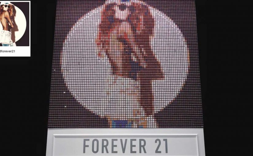
The F21 Thread Screen is a 2,000 pound machine that uses 6,400 mechanical spools of thread to display Instagrams hashtagged with #F21ThreadScreen. Melding fashion and technology, the Thread Screen is truly beautiful and unique. Hashtag an Instagram of you and your friends and see yourselves in a way unlike anything you’ve seen before…

Why this installation is so compelling

The idea is simple. Post with a hashtag. But the output is unexpected. Instead of a screen showing pixels, you get a physical, mechanical interpretation that feels handcrafted, even though it is powered by a heavy machine.

Extractable takeaway: When a familiar action produces a materially different output, people stop, watch, and share the surprise.

Because the installation turns a normal Instagram post into a moving, thread-based image, the same content earns attention as an in-store spectacle.

  • Digital input, physical output. A social post becomes a tangible display.
  • Participation is effortless. The only requirement is a hashtag, which fits existing behavior.
  • It creates a new kind of “share”. People share twice. First on Instagram. Then again when the installation shows them back in a surprising format.

In retail environments, where foot traffic is finite and attention is fragmented, turning social participation into a physical moment can convert passers-by into participants.

How to reuse the Thread Screen pattern

The real question is how you take a familiar social mechanic and make the payoff feel materially different in the real world.

Retail and fashion brands should not just “display social” in-store. They should translate participation into a physical moment people want to watch and capture.

  • Change the medium of the reward. Keep the action familiar (a hashtag), but make the output unexpected enough to feel handcrafted.
  • Design for dwell time. Here, dwell time means the extra time people stay near the installation to see themselves appear and change.
  • Build in the second share. Give people a reason to post again, because the physical result looks nothing like a normal screen.

A few fast answers before you act

What is the Forever 21 Thread Screen?

It is a large-scale mechanical installation that uses thousands of thread spools to display Instagram posts tagged with #F21ThreadScreen as a physical, moving thread-based image.

How does a visitor participate?

They post an Instagram photo with the hashtag #F21ThreadScreen, which the installation then pulls into the display.

Why is this effective for retail and fashion brands?

It turns social participation into an in-store spectacle, giving people a reason to engage, watch, and share again from the physical experience.

What is the key takeaway?

Do not just “display social”. Transform it. The more unexpected the medium, the more memorable the experience becomes.

Toyota: A Siri-ous Safety Message

Toyota: A Siri-ous Safety Message

By hijacking Siri, Toyota in Sweden has found a new way to get people to turn off their phones in the car and stop texting.

With the help of Saatchi & Saatchi they created a radio ad that interacts with the phone without human intervention. It relies on the iPhone being plugged in and charging, and on the “Hey Siri” wake phrase being enabled, so even if the driver is not paying attention, their phone is.

Click here to watch the video on AdsSpot website.

Two separate ads ran during rush hour. One was designed for Apple’s Siri, and the other for Android with the “OK Google” wake phrase.

How the hijack works

The mechanism is voice-command interception. The ad speaks the wake phrase and a follow-up instruction that prompts the assistant to switch the device into airplane mode, provided the phone is in a state where it will listen hands-free. The trick is that radio is ambient, so the command can be delivered even when the driver is not actively using the phone.

In passenger vehicles where phones are commonly used for navigation and messaging, road-safety campaigns win when they reduce distraction without adding driver effort.

Why it lands

This works because it demonstrates the problem and the solution in the same breath. The message is not only “do not text”. It is “your phone can be compelled to stop being a temptation”. The moment your device responds makes the risk feel real, and it makes the remedy feel immediate.

Extractable takeaway: If you can make the safety behavior happen automatically at the moment of risk, you remove reliance on willpower. That shift from intention to automation is what makes behavior change scalable.

What the campaign is really saying about attention

The real question is how to remove temptation at the exact moment distraction becomes possible.

The deeper point is that distraction is not a moral failure. It is a design failure. If the environment keeps inviting you to look, eventually you will. Toyota reframes the ask from “be better” to “build a system that makes the right thing easier”.

What safety campaigns can steal from this

  • Use the medium’s superpower: radio is always-on and hands-free, so it can reach people at the exact time the habit happens.
  • Make the behavior visible: when the phone reacts, the lesson becomes undeniable.
  • Design for constraints: define the exact conditions required for the mechanic to work, then build the idea around them.
  • Offer an immediate fix: a safety message lands harder when it includes a concrete action, not only a warning.
  • Keep the premise singular: one problem, one intervention, one clear outcome.

A few fast answers before you act

What is “A Siri-ous Safety Message”?

It is a Toyota Sweden road-safety campaign built around radio ads that trigger voice assistants to switch a phone into airplane mode, aiming to reduce distracted driving.

How can a radio ad control a phone?

By speaking the wake phrase and a follow-up command that the assistant will interpret, if the device is plugged in and hands-free voice activation is enabled.

Why run two versions of the ad?

Because “Hey Siri” and “OK Google” are different triggers. Separate edits let the concept work across major phone ecosystems.

Is the main value the tech trick or the message?

The trick earns attention. The value is the behavior change prompt. It turns “turn off your phone” from advice into a demonstrated, immediate action.

What could make this backfire?

If people feel the intervention is intrusive, or if it interferes with legitimate in-car use like navigation. The campaign needs the safety intent to be unmistakable and the boundaries to be clear.

Castrol: Vuvu Lyza

Castrol: Vuvu Lyza

The breathalyser test is one of the most common ways to check alcohol levels, and it is also one of the most disliked. Castrol takes that friction point and fuses it with something fans actually enjoy using. The vuvuzela. The result is the Castrol Vuvu Lyza.

Positioned as a first-of-its-kind twist for South African drivers, the idea lets people enjoy the game and still make a safer call about getting home afterwards.

A safety tool disguised as fan gear

The core move is deliberately simple. Merge the breathalyser everybody hates with the vuvuzela everybody loves. The campaign turns a compliance moment into a ritual moment, by putting the test inside an object that already belongs in the match-day experience.

How the Vuvu Lyza works

After the game, drivers blow into the Vuvu Lyza like a normal vuvuzela. The breathalyser element then indicates whether they are above the legal drinking limit, described through an easy colour cue. Green means go. Red means no.

In road-safety communications, attaching a serious decision to a familiar social ritual can reduce resistance and increase follow-through.

Why this lands

This works because it removes the moral lecture and replaces it with a usable object. People do not feel policed. They feel equipped. The “hate” of a breath test is softened by the playfulness of fan culture, and the decision point becomes immediate, visible, and hard to rationalise away.

Extractable takeaway: If your message depends on behaviour change, hide the “compliance” inside an object people already want to use, then make the outcome binary and instantly readable.

What Castrol is really doing

Beyond awareness, this positions Castrol as a brand that shows up in everyday driving consequences, not just in engine performance claims. It also borrows the cultural loudness of football fandom to give road safety a shareable, talkable form.

The real question is how to get fans to self-check at the exact moment match-day emotion can override judgment.

What behaviour-change campaigns can steal

  • Merge pain with pleasure. Put the disliked behaviour inside a loved object or ritual.
  • Make the decision binary. One clear signal beats a nuanced message at the point of action.
  • Design for post-event reality. Build for the moment people actually make risky choices.
  • Let the object carry the story. A physical device is easier to demonstrate, film, and retell than a warning.

A few fast answers before you act

What is the Castrol Vuvu Lyza?

It is a vuvuzela adapted to include a breathalyser, intended to help drivers make a safer decision about driving after drinking.

How does it tell you if you should drive?

You blow into it, and the device indicates whether you are above the legal drinking limit using a simple colour signal described as green for go and red for no.

Why combine a breathalyser with a vuvuzela?

Because the vuvuzela is culturally familiar and fun, which lowers resistance to the breath test moment and makes the safety behaviour easier to adopt.

What’s the core campaign message?

Enjoy the game, then make a clear, safer call before getting behind the wheel.

What’s the biggest risk with this kind of activation?

If the device is not trusted, or the signal is unclear, the behavioural promise collapses. The tool has to feel reliable and instantly understandable.